Minimally Viable Product (MVP)
This project was part of a larger effort to modernize an ecommerce platform - moving from a proprietary, monolithic architecture to an open-source, service-oriented architecture. Overhauling a billion dollar ecommerce channel comes with risks, and to help mitigate a big-bang release approach, this project was undertaken to work as a proof-of-concept for the new architecture, while providing a mobile presence for the fast growing Asia Pacific market. Historically, the vast majority of global transactions occur on a desktop browser through our B2B or B2C ecommerce channel, with many of our users in a lab environment. An existing mobile site offered a very basic product search capability, but was in need of an update. Because the new ecommerce platform was dependent on a parallel ERP upgrade (which typically released country-by-country) we decided to geo-target the new mobile site for countries in the APAC region that were using the new ERP system.
Over the years, our legacy system had added hundreds of features and capabilities; some specific to countries, organizations, user types, or some combination of thereof. While eventually support for these legacy features in the new platform may be needed, our immediate goal was to release a baseline version for mobile use cases that supported:
- Account management (register, login, profile management)
- Product search & filtering (product name, CAS number, product attributes)
- Access to product data including supporting documentation (certificates of origin/analysis & safety data sheets)
- Purchasing (cart management, purchase order payments)
- Order management/tracking
- Product recommendations / cross selling
In addition to offering the above functionality through a mobile web experience, we also wrapped the web application in a Cordova application with a barcode scanning functionality. (See screencast below)
Design
As with many projects on a tight schedule, user research was not included in this effort which was largely driven by IT as an exercise to test teams, processes, and architecture with a release into a live environment. Although our team had conducted numerous research studies and usability tests on the desktop version of the site, we did not have any specific research on mobile users in the APAC region at the time we started this project.
In lieu of formal user research, we fell back to looking at analytics and qualitative data from our existing site to look for pain points and areas of improvement as we considered mobile use cases for our existing journey map and personas. We also leaned heavily on best practices in the mobile commerce space with some anecdotal feedback from our business partners in target countries.
From a branding and visual design perspective, Sigma-Aldrich was going through an aquisition integration, and while a global identity re-branding had been rolled out, a digital style guide or design system was not yet available. To that end, we worked to incorporate the new branding elements into the mobile design while trying to use discretion and provide some flexibility for future adaptation.
Development
Our small front-end development team worked in tandem with various backend service teams, our UX group, QA, operations, and functional analysts on development of the site. Backend teams had varying levels of maturity in restful API design, so we worked closely with them on the APIs to ensure they followed restful design conventions, met the functional requirements, and tried to help guide their architecture from UI-specific endpoints to UI agnostic API resources.
We used a modern stack including React with server-side rendering, Redux for state management, and GraphQL as a sort of proxy layer to java-based API endpoints. We also utilized React Intl for localization / and internationalization, and Jest + Enzyme for testing.
Performance
One of the biggest pain points for APAC users was site performance. In the legacy platform, APAC traffic made a round trip back to North America in most cases, and this latency often caused unacceptable load times and a terrible end user experience. In the new platform, most data is distributed to local data centers, with only a few transactional requests that need to go back to an ERP sitting in North America or Europe. Our target load time for this project was ≤ 1 second (broadband connection) which we were able to achieve in many circumstances.
Screencast 2x
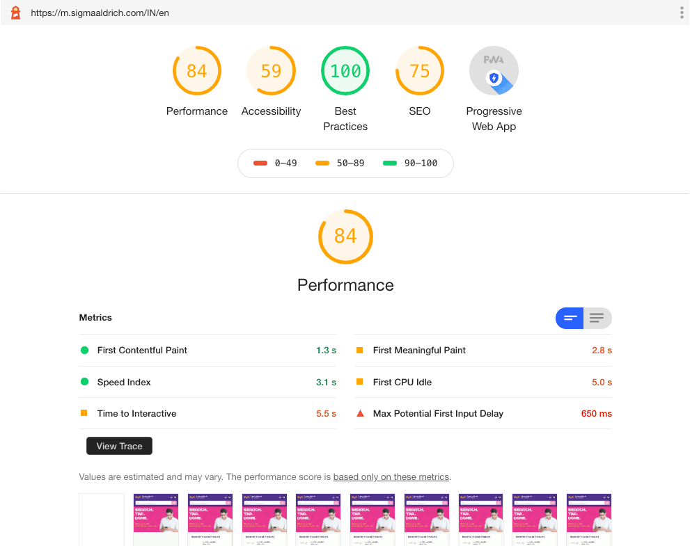
Lighthouse Audit (Simulated Slow 4G, 4x CPU Slowdown)

Beyond the performance of the APIs we consumed, we were able to improve our front end performance by chunking our js files, preloading requests, using service workers to cache static assets, and enable brotli compression for significantly smaller files over gzip.
Google Lighthouse has been a great tool to gauge performance by easily allowing developers and designers to simulate a mobile experience and offering performance improvement suggestions. As we started to benchmark our performance against other popular mobile commerce sites, I was surprised to see how poorly most of those sites performed. I am happy with the performance scores we were able to achieve given the time and resource constraints for this project.
Some other notes from the lighthouse audit:
- Accessibility has easy fixes that were not implemented but should have been.
- Site indexing was intentionally blocked by request of digital marketing team
- Performance numbers are based on simulated network and CPU conditions.