
🎉 Update 🎉
Since this article was published, Figma has introduced independent border styles as a new feature! The update provides a way to achieve independing border styling without the use of hacks!
For more information, check out the feature release article on Figma's website.
While you likely no longer need the workarounds below, I'll keep them posted here for reference. If you need to have border styles with different colors, you may still need to use option 2 below. (Inner Shadow effect)
Basic Figma Auto-Layout
Figma's auto-layout feature has been a real differentiator in its rise to defacto design tool. While basic auto-layout features are really nice to have, there are some scenarios in which an auto-layout solution isn't readily apparent.
In this post, I'll expand on some of the basic auto-layout features and demonstrate a couple of workarounds for a few somewhat common use cases including an auto-layout button with independently styled borders.
The Problem
In my experience, using auto-layout becomes problematic when the design of your component requires different stroke/border properties. For instance, if the borders on your button design are different colors or an active tab state that has a different treatment for the bottom border.
If Figma supported independent border styles (similar to how border radius is implemented), then there would be no need for a workaround. The support community is full of posts asking about independent border styles to solve this issue, and as of yet, the ability to independently style borders is still on the to-do list.
The Workaround(s)
Without the ability to independently style borders, we'll need to use a one of two workarounds. One approach adds complextity to our component with multiple layers of nested auto-layouts utilizing rectangles instead of borders. The other approach uses inner shadow effects to acheive a pseudo-border.
Button Example
Consider we have an old-school button design like in the Nyan UI Kit. A few characteristics we need to build into this component:

- The button design has a beveled style that includes different colors for the top, left, bottom, and right borders.
- The component should automatically grow or shrink based on the button label text
- The component should support a leading and trailing icon
Option 1 (Nested Auto-Layout)
Since we can't independently style the borders, we'll need to slice the button into auto-layout areas.
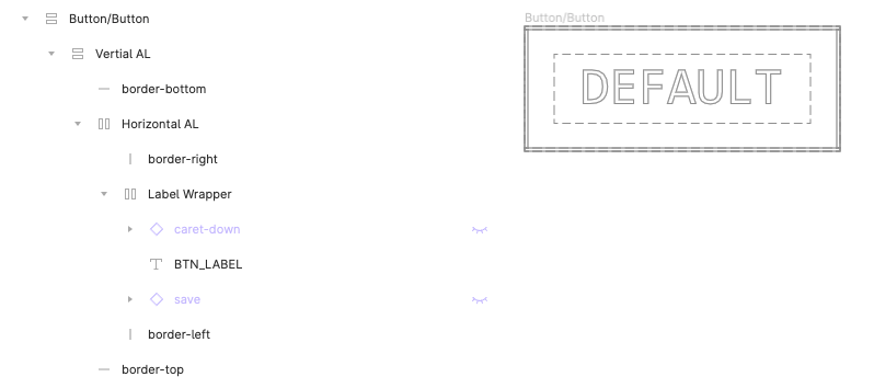
Essentially, we have an outer wrapper that nests auto-layout frames with rectangles as "borders" where the middle frame expands to hug the contents of the button label. Left and right borders have fixed widths and heights that fill the container. Top and bottom borders have fixed heights and the widths fill the container. We need to nest in both directions (vertically and horizonally) to acheive the desired effect.
Within the frame containing our label (Label Wrapper in this example) we have a horizontal auto-layout that contains options for leading and trailing icons as well as our text label. (FWIW, I like to label override layers with all cap snake case so it's easier to see at a glance what is editable in your component instances.)
In any case, you may be thinking that this option involves too much overhead/complexity for what seems to be such a trivial change. I 💯 agree. It also makes developer handoff a little insane since it doesn't even remotely resemble how you would code this button.
There is another approach that is a bit simpler to create, however it also suffers from some of the same dev handoff issues and doesn't work with Figma native color styles...
Option 2 (Figma Inner Shadow Effects)
In this option, we remove some of the nested auto-layout issues and acheive the different border styles by applying Figma effects. Specifically, we use inner shadow effects with attributes that mimick border styles.
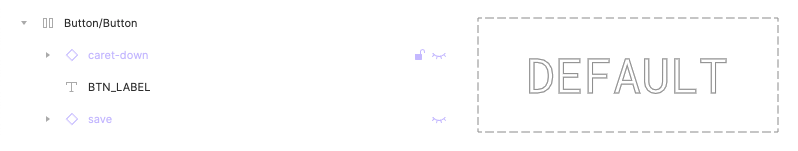
The component structure if much simpler here, and we only use the horizonal auto-layout to deal with the button label and optional icons. To apply a pseudo "border", be can apply a Figma inner shadow effect.
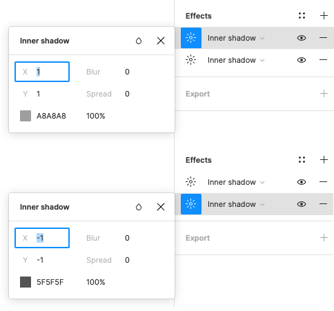
Because our left/top and right/bottom borders share the same color, we can apply two effects to the button to match our auto-layout version. We just need to position them accordingly. One note about effects in Figma: since you can't access your color styles from effects, you'll need to enter the color values manually.
Conclusion
While none of the above workarounds are ideal, it's probably the best we have until we can independently style borders natively in Figma. Beyond buttons, you could also use the workaround above for tabs, inputs, and other elements as needed. To view examples, visit the community file to duplicate and experiment on your own.