
Summary
If you're like me, you can't imagine designing in Figma without auto layout. And while auto layout has become an indispensable feature, many designers still aren't utilizing its full potential...
- Common implementations of auto layout include “inside out” use cases - designing components to adapt to their content. (e.g., buttons)
- Popular but less common, designers may use auto layout to arrange peer components in relation to one another or other UI elements. (e.g., buttons appearing on a modal footer)
- However, as we go “up” on the atomic design scale, the usage of auto layout tends to diminish, but the value of the feature remains constant. (and arguably increases...)
- Using auto layout as scaffolding for page templates has real advantages and maintenance efficiencies once designs start converging and reusable layouts and patterns emerge.
- Using auto layout for page templating can make our designs less fragile and reduce the amount of repositioning needed when we make changes that affect child or sibling elements
In this post and companion Figma file, I'll briefly cover common auto layout use cases and a proposal for extending usage from components and component groupings to include auto layout for templating entire page designs.
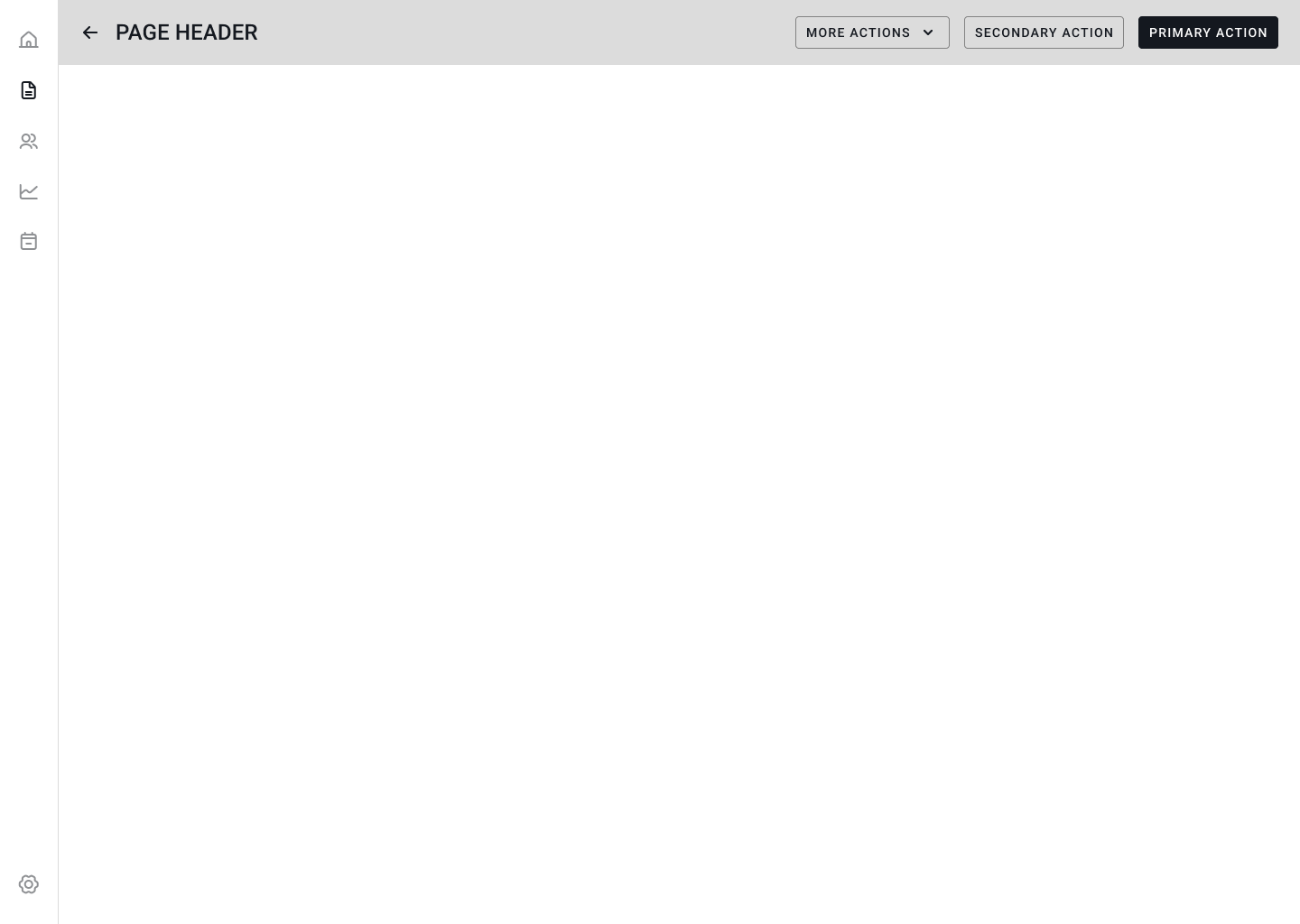
The example above shows how we might use auto layout to scaffold a page template to allow for easier maintenance and less fragile designs. To see how it was created skip to Extending auto layout usage beyond atoms, molecules, and simple organisms section. Before we get there, let's first take a look at more common auto layout use cases:
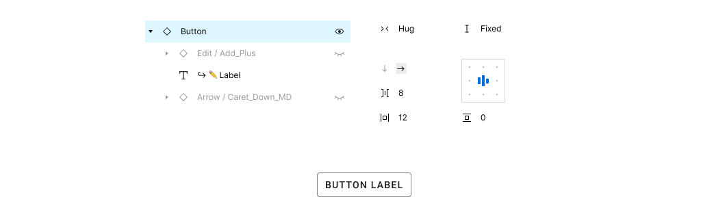
Inside out - components - atoms and molecules
At this level, auto layout is all about adapting a component to its content. Wrap a text object in an auto layout frame, give it some padding, and voilà, you have a rudimentary component that grows to fit the button’s label. Next, add options for leading and trailing icons, wire up the component properties, instance swaps, and you’re on your way to a design system! This is important, and many times our first implementation or exposure to auto layout is in the context of a component.
Peer components - molecules and simple organisms
The next layer up is not so much about adapting UI elements to their content, rather, more about arranging sibling elements in relation to one another or parents. e.g., Instead of dealing with how icons and button labels behave in the context of the button itself, here we are concerned with how groups of buttons are displayed in something like a dialog footer to ensure consistency of primary, secondary, and tertiary actions.
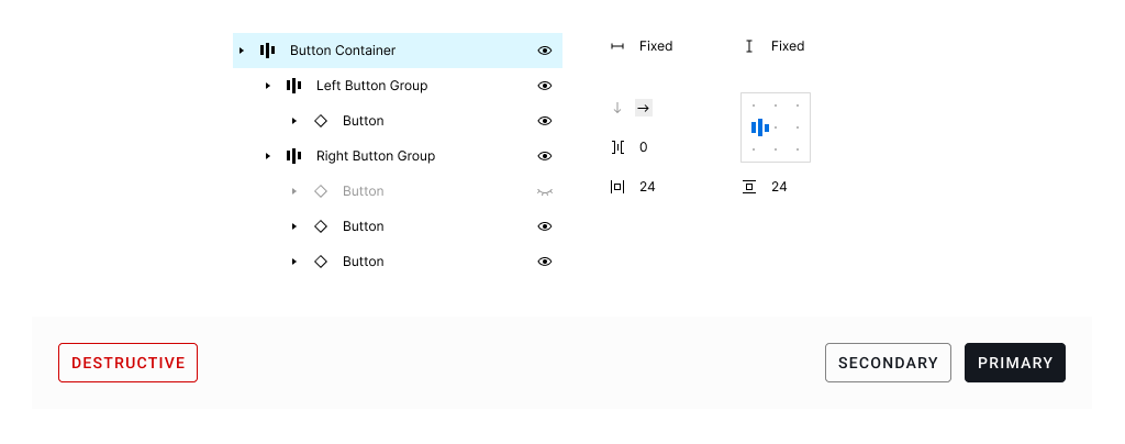
In the Button Container frame above, our design supports common uses where our primary and secondary action buttons are aligned to the right of the container. An optional tertiary button is also available in this grouping, but hidden. In some cases, we may also need a button aligned left to accommodate less frequent or distinct actions (e.g, a destructive action).
This is likely a repeated pattern within our app for which we can componentize - using auto layout to consistently apply alignment and padding values / tokens that support individual use cases (e.g., only primary and secondary buttons, primary, secondary, and tertiary buttons, etc.)
Peer components can contain different/nested components that all behave in concert as "one" organism. Other examples of peer / sibling components would be elements like a page header or navigation component which may contain text, navigation elements, and search a search box.
Extending auto layout usage beyond atoms, molecules, and simple organisms
As designers, we often stop using auto layout once we have a mature (enough) component set that includes a minimal set of atoms, molecules, and simple organisms. After placing components on the screen, we rely on grids, guides, rulers, and measuring tools to nudge elements around the page in order to maintain consistent spacing and alignment. It's easy to overlook the invisible layout rules we've established in any given design because they're not bound or defined by anything other than x,y position on the screen. If you change the position of one element, you're obliged to manually change the size and/or position of its neighboring elements to maintain uniformity.
This cycle of manual adjustments can feel a bit like playing whack-a-mole; it's tedious and error prone. Quite conveniently, we have a tool that can help in this regard, and it's been sitting under our noses...
Before we go any farther, I want to add a few important caveats to using auto layout in context of page layouts / templates:
🚨 Premature use of auto layout can lead to headaches
- In early design stages, when designs are still diverging and the UI is volatile, it's better ignore auto layout and focus on getting the design right
- Loosely following a grid system or guides at this stage can help keep things consistent without requiring too much rework of auto layout settings when things inevitably change
- As designs mature and solidify, consider adding auto layout to overall page structure as part of your design workflow
Building an auto layout structure “all the way down” the layer tree takes some up-front planning, but pays dividends down the road. When properly configured, changes to things such as width, component states, or different content will automatically adjust other elements on the page - removing the need for manual repositioning. I believe the key is to find the right time in your workflow - this will vary based on your team's process and structure. Generally, a good time to introduce this is when you're ready to "scale" designs.
Building our page scaffoling
What does auto layout look like for page scaffolding? In the atomic design metaphor, we have complex organisms like pages and templates. As an example, let’s imagine a typical web application that consists of expandable/collapsible side navigation, page header, tabs, buttons, table, and pagination...
- We can use a component’s auto layout to make sure that our sidenav will remain consistent when used at different heights, or that our page header can expand to accommodate different page widths
- However, when those components are nested in an auto layout page structure, we can let the page layout do much of the work that we might ordinarily have to do manually by setting widths, nudging components, or making separate designs for the sidenav in a collapsed and expanded state
- Similarly, when we use auto layout structure for the page itself, we can easily handle things like pagination location relative to different table content (e.g., 5 rows vs 25 rows) without any manual adjustment of the pagination location
- We can also do things like designate what columns of our table should remain a fixed width versus what columns should grow or shrink depending on the width available to the table container
👉 Reminder that you can duplicate the Figma Community file to explore on your own.
Step 1
In the first step, we'll split the parent frame into two zones - one for our SideNav and another Main Content for our remaining UI elements. It's important that the parent frame is set to a horizontal auto layout orientation, and height and width are set to fixed. This allows us to resize the parent frame and the child contents will adjust as configured. (Usually child frames are set to fill container or fixed width depending on your layout needs)
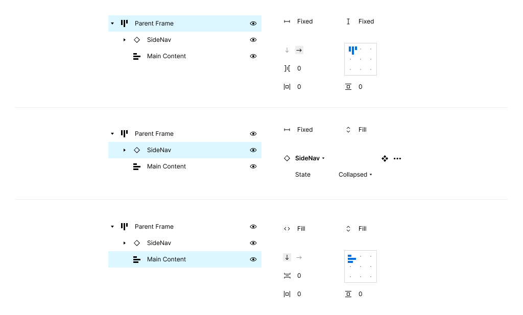
Notice that our first child (SideNav) is a component. Within the component, we have a collapsed and expanded state. Each of these variants are a fixed width, and the Main Content frame is set to Fill container. This ensures that the elements we add to main content will adjust based on the remaining width available regardless of whether the sidenav is expanded or collapsed.
Step 2
Now that we have our two main zones setup, we can start adding elements to the Main Content frame. In our previous step, we configured the Main Content auto layout direction to vertical. As we add children, they will stack vertically. In this step, we'll be adding a Page Header component that has already been configured.
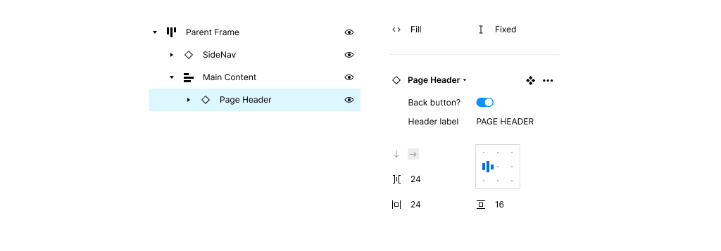
You can see that the Page Header width is set to fill container to accommodate different widths of the Main Content frame. I've also listed the auto layout properties of the component which, although defined in the component, are also exposed here.
Step 3 +
I'm combining a few steps here as they are very similar to our last step. Essentially, we'll keep adding children to the Main Content container to flesh out the rest of the template UI. I'll circle back to our table in step 4.
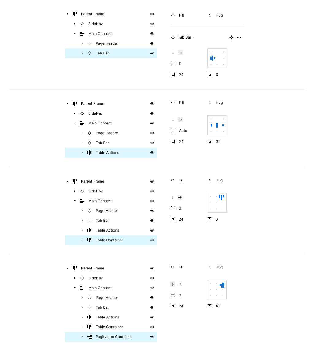
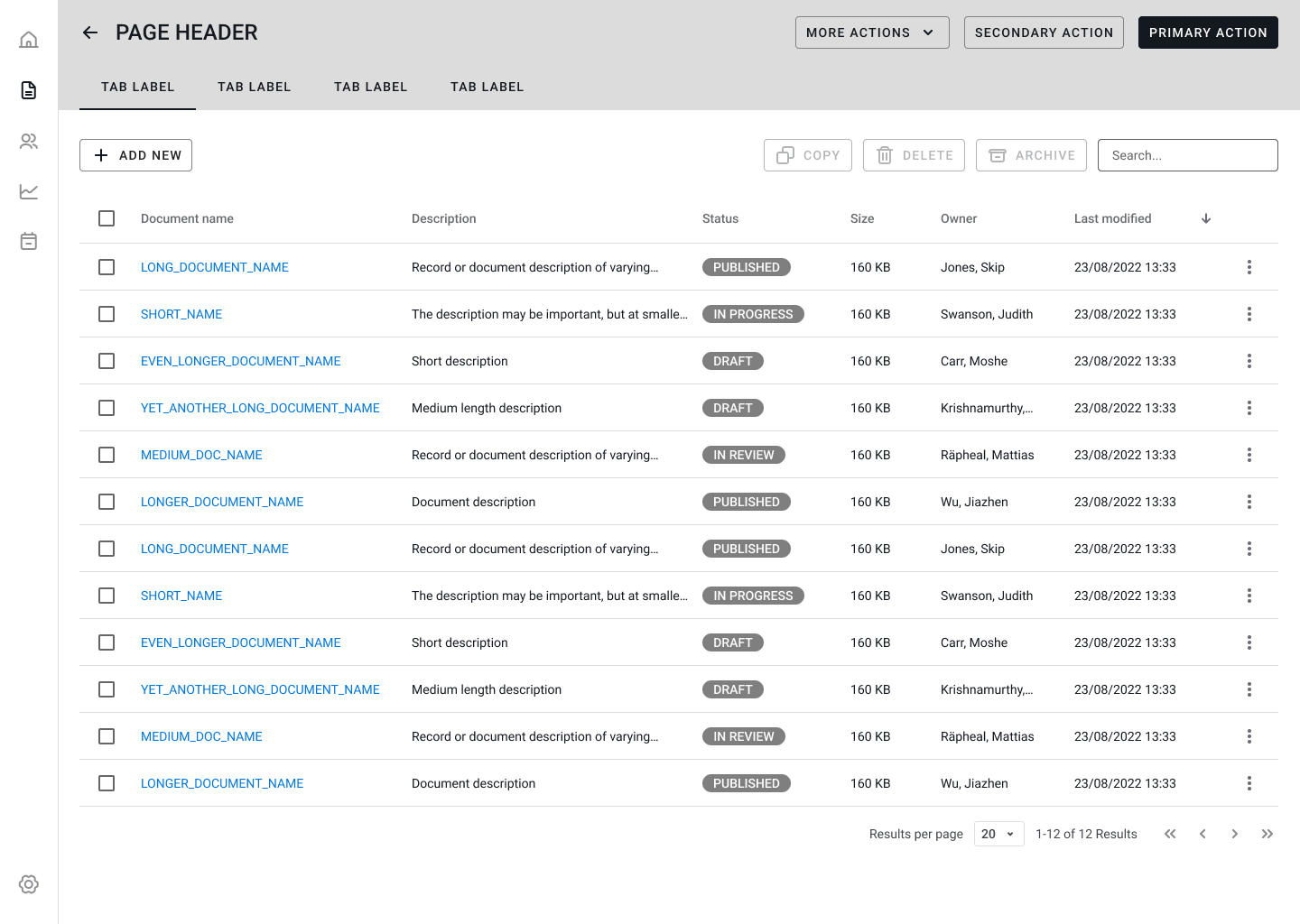
Below the Page Header component, we've added a Tab Bar, row of Table Actions, a Table Container, and finally a Pagination Container. You can see what the page looks like with all of them added below:
Step 4
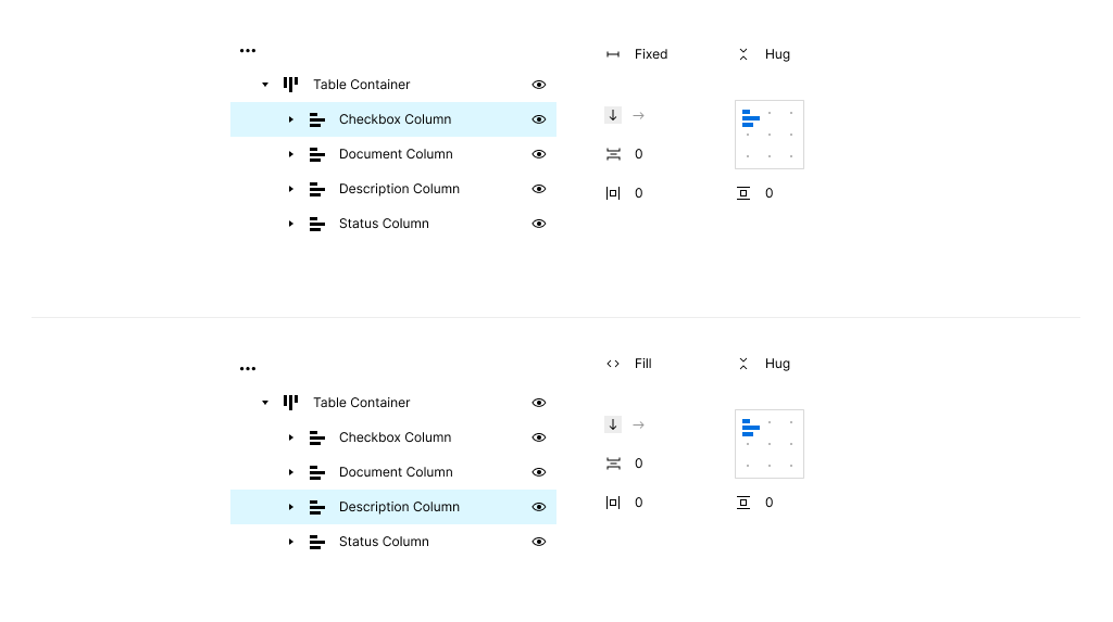
Let's take a closer look at the Table Container structure in this example. Similar to other children of the Main Content container, its width is set to fill the container and its height to hug contents. The auto layout direction is set to horizontal, so that the children of the Table Container (the table columns) will stack up side-by-side.
Within each column, the table cell children stack vertically. Each column can be configured with different settings for width which impacts how the overall table is displayed. To illustrate how this works, let's look at the Checkbox Column and Description Column.
The Checkbox column allows users to select one or more table rows, and since it will always be a consistent width, we can set that width with a numeric value (60px in this example). Applying fixed width to columns is a good strategy for predictable content such as dates, timestamps, etc.
In addition to fixed width columns, we can also choose to set column width to fill the container. In this case, the Description column will fill the available space minus what was apportioned to the fixed width columns. This is a useful strategy if one or more columns in your table are less important. Combining with text overflow:ellipsis provides a good way to deal with variable content / string length as well.
Working with nested components and their auto layout settings can be tricky. A few caveats and notes around working with fixed and fill width columns like above:
- You may notice unexpected results if your column width setting is not in sync with all of the child table cell width settings. (e.g., if your column is set to fill container, but your individual table cells are set to fixed width, you might see some weird blank spots in your table) If you encounter this, check that the columns and cell widths are compatible.
- When columns (and their children) are set to fill container, the column widths will be equally split among the available space.
- If your table container is wider than the sum of your fixed width columns, you will have an empty area on the left or right of your table container depending on your alignment settings.
- If many of your columns are fixed width, you might want to designate at least one column set to fill container to accommodate varying parent container widths.
Why are we doing this again?
I realize this may seem like a lot of extra boilerplate steps that could be seen as superfluous, so let's take a step back and address a few common questions around this approach.
What is the advantage to this approach if most of my screen designs are static? Can I use this for responsive design?
This depends on your circumstances - if you're designing a responsive app, it's common to implement screen designs at different breakpoints (desktop, tablet, mobile). While Figma's auto layout feature is useful, it's still not robust enough to handle a full-fledged responsive design as it doesn't support layout wrapping, conditional media queries, etc. For this reason, I don't think of this approach as a solution for responsive design. Instead, I would frame this as a way to make scaling designs and maintenance easier.
As an example, I was recently working on a project for a desktop-only application that ships with its own computer and monitor. The minimum requirements specify a resolution which we target in our designs. While we have a good idea of the end-users environment, during usability testing, it was apparent that some participants would be using a lower resolution monitor or laptop. Because of this, we needed to produce a prototype in a lower resolution than we target in our designs. Rather than manually adjusting dozens of screens and playing whack-a-mole with positioning, I just changed the parent frame dimensions and the contents of the design adjusted accordingly. This saved days of extra work and was an immediate return on investment.
Can't I achieve similar results using grids and constraints?
Yes, there are existing patterns that allow you to set up grids within frames and then apply constraints with similar outcomes. Like the pattern outlined in this post, it can involve nested frames all with their own grids and constraint settings. Grids really shine when you want to distribute things evenly within a frame, but (in my opinion) don't offer the flexibility afforded by auto layout.
Can you 'componentize' page templates?
Yes, although you may want to first try this without componentizing (just use auto layout frames) to see if it fits your needs. When you choose to make something a component, you essentially surrender any structural updates to the child elements (unless they are all components themselves and you can update via component properties or visibility settings).
Wrap up
Auto layout is an essential feature and commonly used to create components and simple organisms. Using auto layout for complex organisms such as templates and page design is often overlooked by designers, but can provide many advantages such as consistency, flexibility, and reduced manual repositioning when introduced into your workflow. Consider exploring the companion Figma Community file to see how this approach could benefit your process.