
Scenario
So your design team moved to Figma and has been working on a design system. You're dutifully updating the components, documentation, and the components are being used in several project files. The engineering team browses your design files and may occasionally leave comments, but your carefully selected color and spacing decisions appear to only have been suggestions when you view the latest builds. So what is going on?
You talk to the engineering lead and realize it's not as simple as you had imagined. While the development teams genuinely care about the UI and experience for the end user, they are in a tough spot when it comes to schedule and resources. They have some backend devs working on the front end code due to resource constraints, they're tied to an older tech stack or library, a lot of tech and design debt have accumulated over the years since they're performance is measured on new feature development. The list goes on, but you realize developers barely have time to look at your design layouts and only rarely have the luxury to inspect your figma file to extract the design details.
After some back-and-forth, "what-if..." or "how might we..." conversations, you agree to spike a joint effort on design tokens; as a designer, you've been reading a lot of articles on design token integration and their benefits. The engineering lead likes the concept because it could remove some of the manual work done by developers in keeping up with stylistic changes.
Although this is a kind of fictionalized composite scenario, it's probably a common enough that you may find similarities with your own experiences. It may seem that design systems, tokens, and automation are the norm by reading the latest twitter threads or medium articles, but in reality, the distribution of these practices probably looks like any other bell curve where the bulk of teams fall somewhere in the middle - maybe processes are in place, but they're not fully automated or documented. Most teams are still finding their way through all of these practices looking for small opportunities to improve.
Investigating a design automation pipeline
In the scenario above, the design and engineering teams agree to spike out an effort to investigate design token automation. This post will loosely follow a similar format, focusing on the overall workflow, tools, and how to get a small proof-of-concept off the ground. This post will assume you have a basic understanding of design tokens and front-end development. If you're looking for a introduction to design tokens, this is probably not the post for you, but there are plenty of great articles dedicated to their naming, structure and other details.
This post explores only one of several ways to stand up a design token pipeline and while it may not fit your particular needs, it may trigger some ideas that you can shape on your own.
High-level workflow
At the 40,000 foot view, we'll cover:
- Using design tokens in our design tool (Figma)
- Linking those tokens to a single source of truth (Github repository) for syncing
- Automatically transforming our design token format (.json) using token-transformer and style-dictionary to generate css variables
- Pushing those updated css variables into our component code (Stencil) and triggering a build
- Publishing a Storybook page with our updated components and design decisions

- Figma Button Component - Figma community file which contains our button component design
- token-demo-src - Repository that contains our design token json files and where we do our token transforms using style dictionary and token transformer
- stencil-storybook-token-demo - Repository that contains our stencil components and storybook code
Figma & design tokens
If you're using Figma, there are several tools and plugins to support design tokens, although hopefully we'll see native support from within Figma soon. At the time of this writing, Tokens Studio (aka Figma Tokens) seems to have the most momentum. For this demo, we'll use the proverbial button component which references design tokens for things like color, padding, typography, etc. To add a touch of complexity, we'll have a button component that supports two different brand designs.
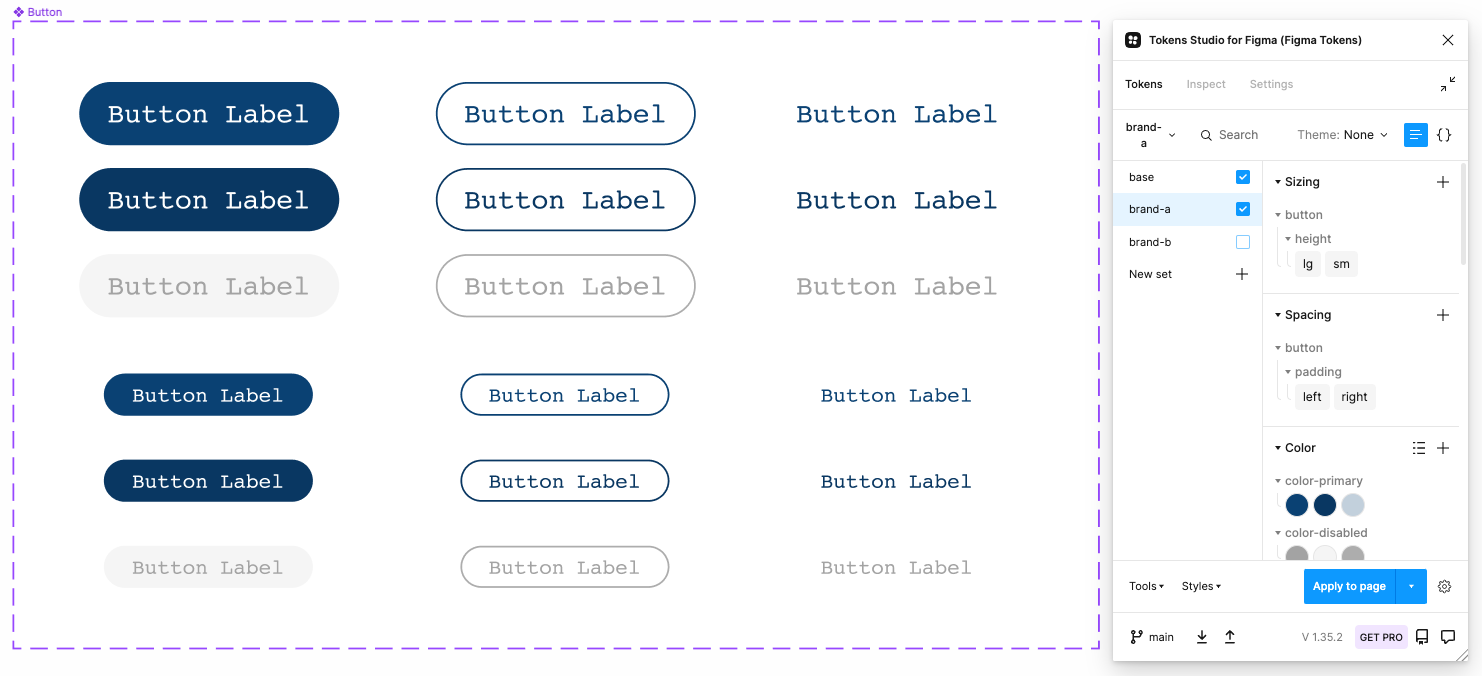
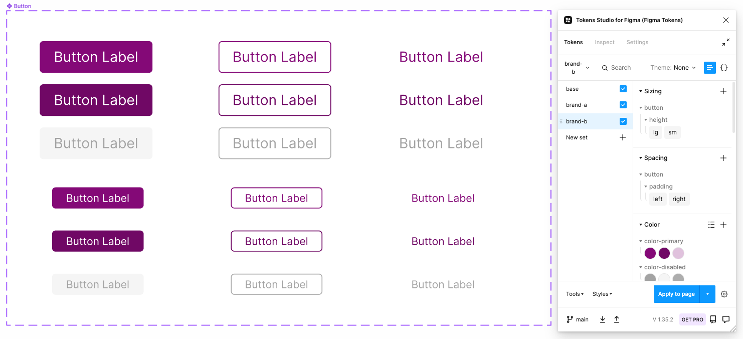
You'll notice for this demo, we have a very simple set of "base" tokens defined which are really just key:value pairs with minimal context (This would be things like color and spacing scales). We apply context and give them semantic meaning in our "brand" tokens where we simply reference or alias the base definition. Our designed components reference commonly named tokens whose value may change depending on the brand selection.
Setting up your github repository
By default, Figma Tokens reads and writes tokens locally, but in order to use tokens as a source-of-truth, they'll need to be in a central location. Several options exist for storing tokens, but in our case we'll use a Github repository. Documentation for syncing with github is available on the Tokens Studio for Figma site.
If you want to follow along with this post, you can access the Figma tokens used in the example in our Github repository.
Once you have your tokens synced, any changes made within Figma can be pushed to Github. Inversely, changes made outside Figma can be pulled in from Github.
Using Token Transformer
Figma tokens are stored as .json, something that allows for flexibility and easy parsing. This also allows the plugin itself to use references or aliases. For example, you may see something like:
"color-primary": {
    "default": {
        "value": "{color-base-green.60}",
        "type": "color"
    }
}
Here we have a brand token representation color-primary.default with the value defined in the base token set {color-base-green.60}. A familiar concept if you've used .scss or .css variables.
We'll eventually need these tokens in the form of .css variables, but unfortunately the Figma token format doesn't always play nicely with Style Dictionary - the build tool we'll use to generate the styles used in our downstream code components. To use style-dictionary, we'll first need to transform our tokens using a tool call Token Transformer which will act as a sort of intermediate step to prepare our tokens for style dictionary.
The Figma tokens output file, design-tokens.json basically has 3 root-level objects that correspond with our token sets.
{
    base: {...},         # core key:value pairs for generic things like color and spacing scales
    brand-a: {...},      # semantic tokens with values specific to our "brand-a" design
    brand-b: {...},      # semantic tokens with values specific to our "brand-b" design
}
We're going to run a few token-transformer commands that will will do a couple things:
- Take our single
design-tokens.jsonfile and break it into 3 separate files (base.json,brand-a.json,brand-b.json) - Resolve all the nested variables from references to actual values
We'll automate this in a later step, but to test out our commands, you can try them at a terminal.
# usage parameters
    token-transformer input output sets excludes

# creates base.json from design-tokens.json using the base object
    token-transformer design-tokens.json base.json base

# creates brand-a.json from design-tokens.json using the base & brand-a objects, excludes base from the export
    token-transformer design-tokens.json brand-a.json base,brand-a base

# creates brand-b.json from design-tokens.json using the base & brand-b objects, excludes base from the export
    token-transformer design-tokens.json brand-b.json base,brand-b base
💫 Note: You can also configure the Figma tokens plugin to save your tokens sets into separate files rather than one
Once completed, 3 new .json files should be present with references resolved, containing all that is needed for style dictionary to do its work.
/input
  design-tokens.json      # design token file outputted by Figma
  base.json               # base tokens generated from our first token-transformer command
  brand-a.json            # tokens for our brand-a theme generated from our second token-transformer command
  brand-b.json            # tokens for our brand-b theme generated from our third token-transformer command
Using Style Dictionary
Style dictionary is a powerful tool that can take design token definitions as input, then transform, orchestrate, and build style outputs for multiple platforms. Since our scope is limited, we'll only targeting for .css outputs in our demo, but you could easily add support for other platforms such as scss, android, or iOS. In addition to building our outputs, style dictionary can transform our token names or values along the way... One practical transformation we'll add in this demo is conditionally converting px to rem units for our typography-related tokens.
You can view the script we're using to generate output files in our Github project. I've added some general comments to describe each step, but essentially, we'll be:
- Mapping over the properties in our input files and constructing the css variable format (e.g.,
--${prop.name}: ${prop.value}) - Defining a custom transform which checks the token type, and conditionally converts font size properties from px (as defined in Figma) to rem (as used in our code components)
- Applying our custom and predefined transforms and outputting the results in the form of .css files
After we run our build command, we should end up with 3 css files located in our output folder:
/output
  base.css        # base css variables
  brand-a.css     # css variables for our brand-a theme
  brand-b.css     # css variables for our brand-b theme
Creating a Github action for our token pipeline
Now that we have a general flow from our design tokens to css variables, we can begin to automate the process. This is a perfect use case for Github actions, which provides a way to trigger workflows and scripts based on repository events.
In our scenario, we have design tokens managed through our Figma Tokens plugin. Because the tokens files are stored in a repository, when we update token values in Figma, those updates can be pushed to Github. This is the trigger we need to execute all of our downstream actions outlined above.
Github actions are defined using yaml markup and outline procedural steps for a given workflow. Github provides common actions that can be referenced in your workflows (e.g., Checkout, Set up a Node environment, Upload an artifact) as well as a marketplace containing custom actions written by users. We'll use a combination of standard actions along with a few custom actions written by other open source contributors. To see the workflow used in this post, view the build-tokens.yml
In the build_tokens job, we simply checkout our project files, install dependencies, and run our token-transformer commands and build script outlined above. Once this is completed, we commit the changes (which will include the output css files) back into the repo with an auto-commit action.
🙌 At this point, we have a nice little workflow that solves part of our problem:
- Designers can define and update design tokens using their favorite design tool
- We've removed some of the silos / walled garden and made those design tokens accessible by storing them a git repository
- Bonus: We now have versioning and history for those design tokens
- Developers now have access to the latest versions of those design decisions
- We can now automate the process of transforming those design decisions into formats and outputs used in the development process
While this is good progress, if we abandoned our investigation here, we would only be addressing part of our problem. To take our solution a step farther, you may notice there is another job (copy_tokens) defined in the Github action referenced above – one which pushes our css variable output to a different project where our code components are defined...
Integrating design tokens with code components
Now we have our pipeline capable of outputting css variables from Figma tokens, however, those vars still aren't directly being used in our code (yet).
Design systems without code are really just UI kits. In order to truly build a design system, we need to have components working in code, not just within Figma. Ideally, we want a tight integration between the two so that decisions made on the design-side are reflected in the code with minimal effort.
Creating a Stencil component
While engineering teams may have different needs and tech stacks, in this investigation, we'll be looking at using Stencil, a library to build web components. In theory, web components could be used like native html tags and allow you to define components in a framwork-agnostic way, but in practice, they haven't really gained the momentum needed to supplant component creation in the most popular js frameworks (e.g., React, Vue, Angular). Personally, I haven't used web components outside of this post, but I thought this would be a simple enough use case to take them for a spin and learn more about them.
To align with our Figma component design, we'll be creating a button component using Stencil. After some boilerplate stencil dependencies, we can start defining our button with the same properties defined in our Figma components. I've intentionally made the button component somewhat basic, but I think it still gets the point across. The code for our button component is available in the demo repository stencil-storybook-token-demo.
In the design, we have variants for the button type: (Primary, Secondary, or Tertiary) as well as size: (Large or Small) and state: (Default, Hover, & Disabled) In our stencil component, we can define these as Properties using the @Prop() decorator.
Including token-based styles
When we render our component, we can attach class names based on what properties are active. You can see more about this when we get to our Storybook tests.
render() {
  return <button class={this.getCssClassMap()} onClick={this.handleClick.bind(this)}>{this.label}</button>;
}

getCssClassMap() {
  return classNames(
    'button',
    this.size && `button--size-${this.size}`,
    this.variant && `button--variant-${this.variant}`,
    this.disabled && `button--disabled`
  );
}
And our button classes can be defined using our css variables.
.button.button--size-large {
  font-size: var(--button-typography-lg-font-size);
  height: var(--button-height-lg);
  font-weight: var(--button-typography-lg-font-weight);
}
Finding the right token specificity
Before moving on, I wanted to at least touch on the issue of specificity in token naming. The naming structure of tokens is something that requires careful consideration and planning. Because this is a demo with exactly one component, I didn't need to think much about design token naming taxonomy. As you can see, I'm using names specific to a component (button-*) which makes this demo easy to understand.
💫 In real life, if you go all-in on component-specific tokens, you can be very granular in configuring your components, but it can result in duplication of values and introduces overhead complexity. On the topic of general naming, the best resource I've seen is Nathan Curtis' excellent article on Naming Tokens in Design Systems. If you're thinking about component-level tokens, read Nate Baldwin's article Component-level Design Tokens: are they worth it?.
Storybook integration
To round out our demo, let's use Storybook as a way to present our components with some context and configurable properties. This will allow us to test our components and provide a a way to edit the properties of our component in real-time to view changes.
To do that, let's add a my-button.stories.tsx file co-located next to our stencil compoment. We'll do basically two things from here:
- Define a template that uses our button component with default property values
- Map Storybook UI controls to those properties so we can preview changes
Let's not forget that we have to support two brands in our component, so we'll need to allow the button's parent theme to be changed as well. For that, we'll add a theme switcher for components inside storybook's preview.js file. This will add a css class on an ancestor element that will allow us to swap css variable values based on the selected theme.
Automating (again) with Github actions
Upstream of our Stencil and Storybook code, we have our design tokens and style dictionary. Changes to Figma tokens triggers a workflow which transforms tokens and builds css variables. The last job in that workflow will copy the new css variable files into our stencil-storybook-token-demo project.
When new variables are pushed into the repo, we want to automatically build components and deploy our storybook documentation using the new values. To do that, we'll employ another Github action: bd-storybook.yml. In this workflow, we'll look for changes to our components, stories, or css files and then proceed to run through a series of steps that will checkout, build, and commit our changes automatically. The last step in the process will deploy our storybook documentation to a gh-pages branch where we can view our updated component docs. To see the storybook docs we generate as part of this demo, visit our Github page and play with our Multi Theme Button.
Summary
Coming full circle, we now have a proof-of-concept design automation pipeline that allows us to:
- Tokenize design decisions made in Figma
- Access a single source of truth for updates along with version control
- Automatically transform tokens into a consumable format for our code components
- Use those updated values in our components
- Generate and deploy documentation for our components
Not a bad start! Of course, there are several areas that we could improve upon, but it's not a bad outcome for our a proof-of-concept exercise. If you wanted to explore a more turn-key solution, platforms like supernova.io and zeroheight.com offer similar functionality wrapped in a GUI with lots of bells and whistles.
- Figma Button Component - Figma community file which contains our button component design
- token-demo-src - Repository that contains our design token json files and where we do our token transforms using style dictionary and token transformer
- stencil-storybook-token-demo - Repository that contains our stencil components and storybook code
Caveats & inspiration
This is a super-simple implementation that utilizes lots of ideas pulled together from sources like Michael Mang and Jan Six. There is a lot of room for improvement in this repo, for instance the design tokens structure and naming need to be refactored and is not something I would necessarily recommend outside of a proof-of-concept project. v16.13.1